In our communication work, we often back up our talking points with data. While stories are almost always more engaging than data, some situations call for metrics to emphasize a point or give context to the overall narrative. Presenting data to the general public in an accessible and engaging way can be tricky. Luckily, Green Fin Studio has put together a list of our best practices for data visualization!
This list of best practices assumes that you already have data and have already explored the story that it tells. If you have just been handed a large dataset, you will need to explore that data before moving forward. David McCandless is a great inspiration for that stage of data visualization; watch his TED Talk here or explore the Information is Beautiful website.
Pick the right visualization for your data.

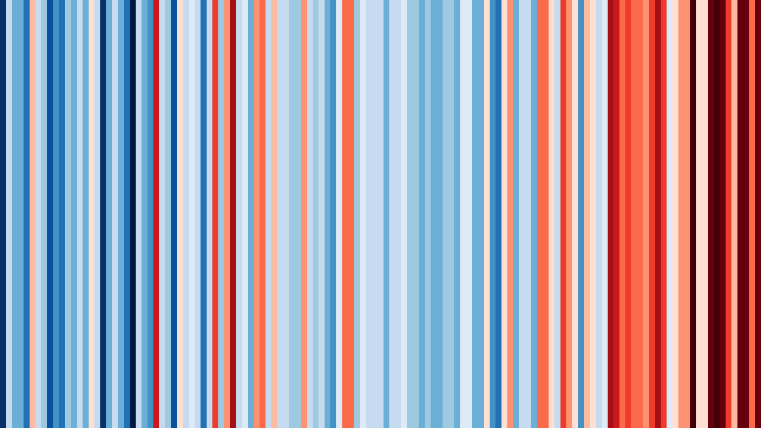
You’ll notice we didn’t mention pie charts, even though they are a classic chart type. We agree with information design guru Edward Tufte that pie charts are not as useful as people seem to think. The brain is not able to quickly compare similar slices of a pie chart, but can almost instantly tell which bar is taller. If you’re looking for something a little more engaging than a bar chart to compare percentages, try a waffle chart (or a plum pudding chart, which is what it’s called when it’s circular). Yum.
Design it well.

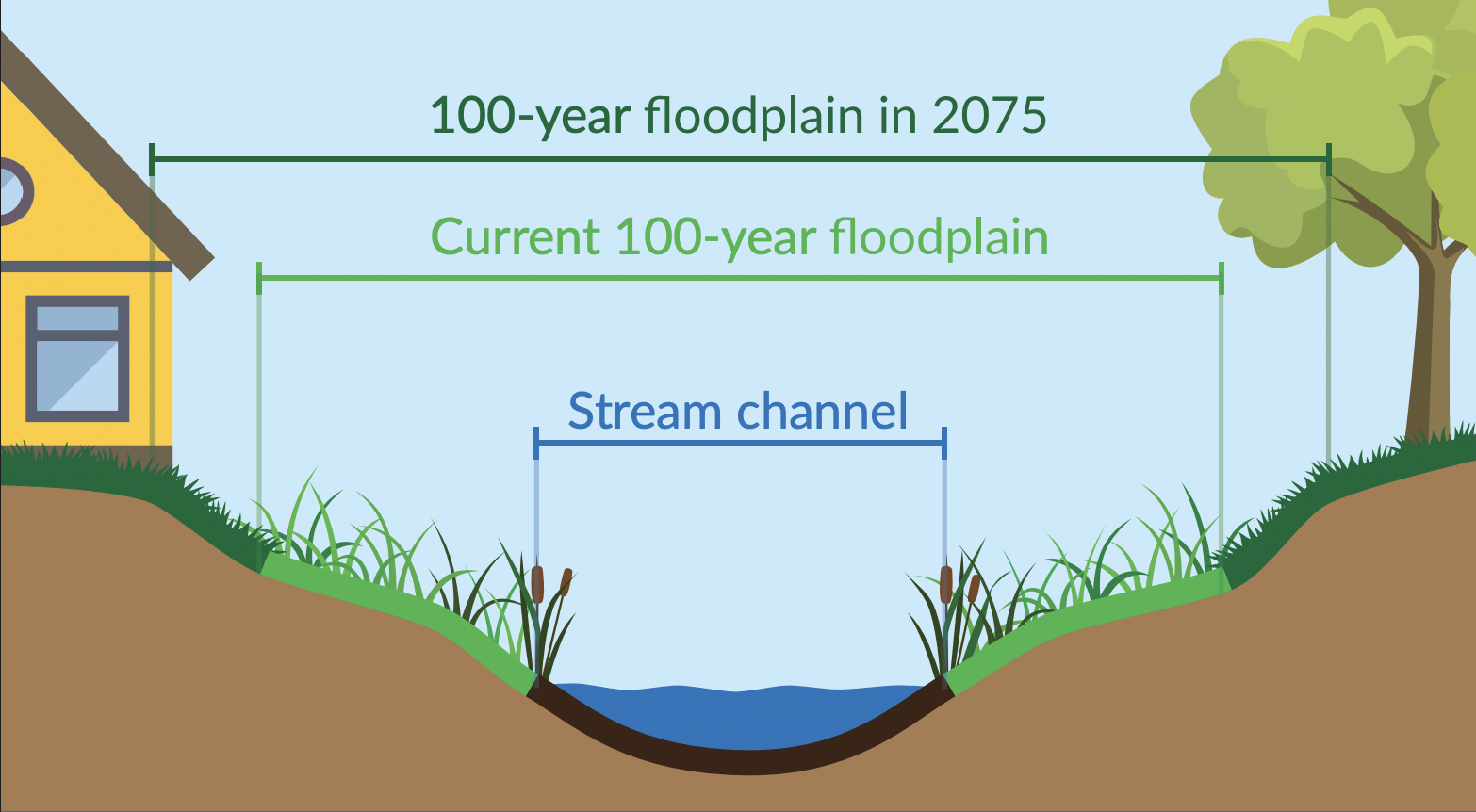
A good data visualization is simple and lets the data speak for itself. Each element of the visualization should encode some information; if it doesn’t, simply remove it. Tufte calls excessive, decorative elements “chart junk”. While we often incorporate icons or colors to make visualizations more engaging, we make sure that each aspect conveys some meaning. In the example below from the Piedmont Environmental Council’s Preparing for Resilience, Tufte may consider the rainclouds chart junk, but we used them to grab attention and emphasize risk.
When designing a chart, make sure to use colors that are intuitive with the subject matter. In the example above, we’re discussing rainfall and chose blue for the bars. A graph about trees might use green or brown. If the chart is within a larger report or infographic, match the colors used in the larger product for a cohesive and visually pleasing design. Another consideration when choosing colors is accessibility. Use colors with high contrast against the background color and that are distinguishable for those with colorblindness. There are numerous tools online that calculate your contrast ratio and allow you to view images through a filter that simulates colorblindness.
This should be obvious, but don’t distort the data.
The number one best practice of visualizing data is not to lie. Don’t cherry pick your data points, use axes that make sense, and make sure representations of the data are proportional. This is especially important when using alternative chart styles that you may not have used before. For example, when creating a bubble chart, make sure that the area of your circle, not the diameter, scales with the data point.
Lastly, labeling your visualizations will help safeguard against unintentional misinterpretation of the chart. Whenever possible, we like to also link to the data source so that anyone interested in diving deeper can engage further.
Have you seen a data visualization lately that dropped your jaw? Does your organization need data visualization help? Reach out to us at hello@greenfinstudio.com. We’d love to hear from you!


